Prototyping
•
User Behavior Analysis
•
Usability Testing
How I designed the re-enrollment flow, automating financial processes and boosting debt clearance and re-enrollments.
Squad team
Product owner, devs, and I
Role
UI/UX, Researcher, Recruiter
Tools
Figma, Maze
What were the problems?
Before, each re-enrollment was done manually with human contact.
Low conversion rate
Needed an operator
No previous version
Designing the experience
After aligning with the stakeholders and the responsible department, I designed the entire re-enrollment flow, including the part showcased in this case study as well as the back-office configuration section.


Validating with users
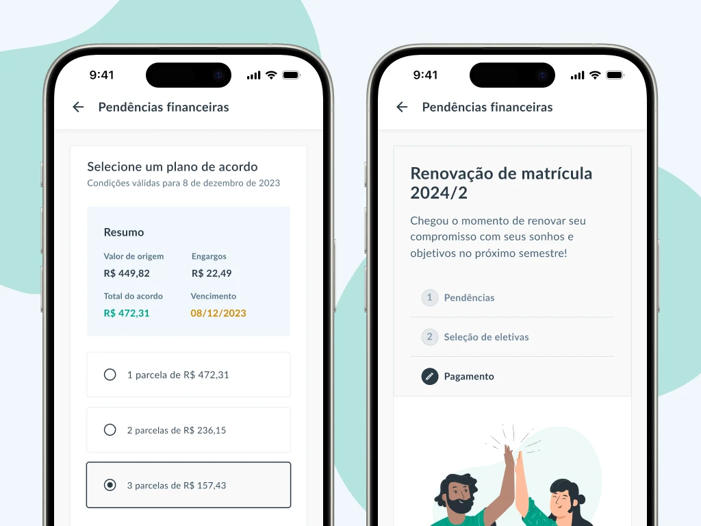
Together with the Product Owner and stakeholders, we wanted to validate whether users understood the difference between choosing Proceed to Payment or Proceed to Negotiation (screen 4 above).
However, an unexpected problem arose: some users reported confusion on another screen due to 2 payment boxes appearing consecutively.

Maze test showed users were confused by 2 consecutive payment boxes.
13 unmoderated tests performed
All felt confident regarding screen 4
Dual boxes led to confusion on screen 2

Utilizing a step-by-step pattern to avoid confusing users about the existence of 2 separate yet sequential payments.
According to the responsible department, after this feature was implemented, the number of outstanding payments and re-enrollments increased significantly.
Thank you for your time
View other cases