Prototyping
•
User Interview
•
Usability Testing
How I redesigned the e-commerce health courses marketplace to enhance the user experience and achieve faster product time value.
Squad team
Product manager, devs, and I
Role
UI/UX, Researcher, Recruiter
Tools
Figma, Miro, Calendly
What were the problems?
The previous system, initially built as an MVP on a ready-made e-commerce platform template, faced issues with bugs, responsive issues and inability to add new features. Therefore, a new custom-coded system was created, incorporating significant improvements in interface and usability.
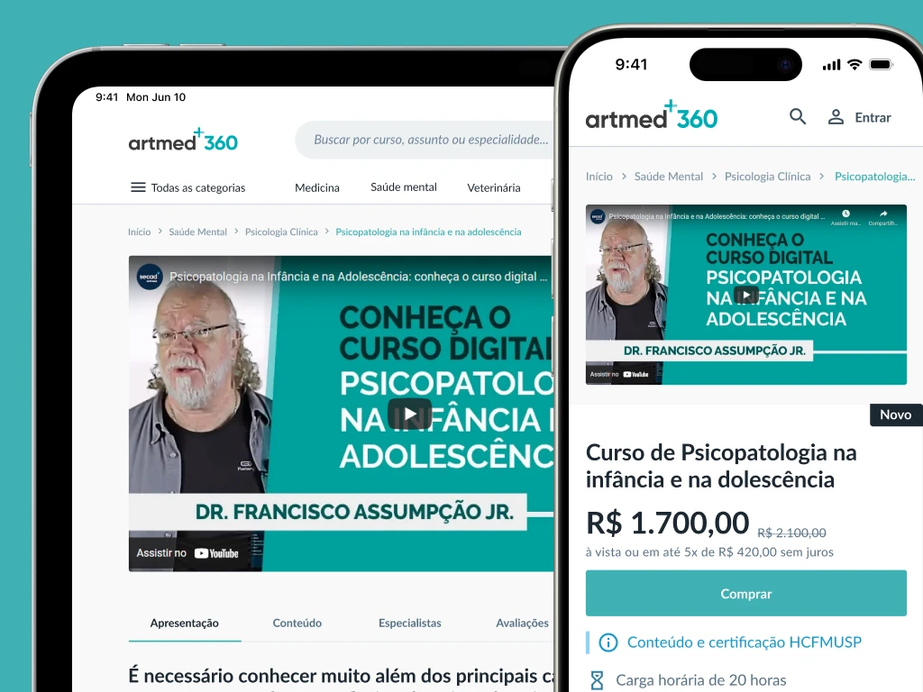
The main point identified in a contextual interview I conducted before starting the project, was that the course preview video was important yet hidden.
previous experience
The main screens and the user flow of the experience.
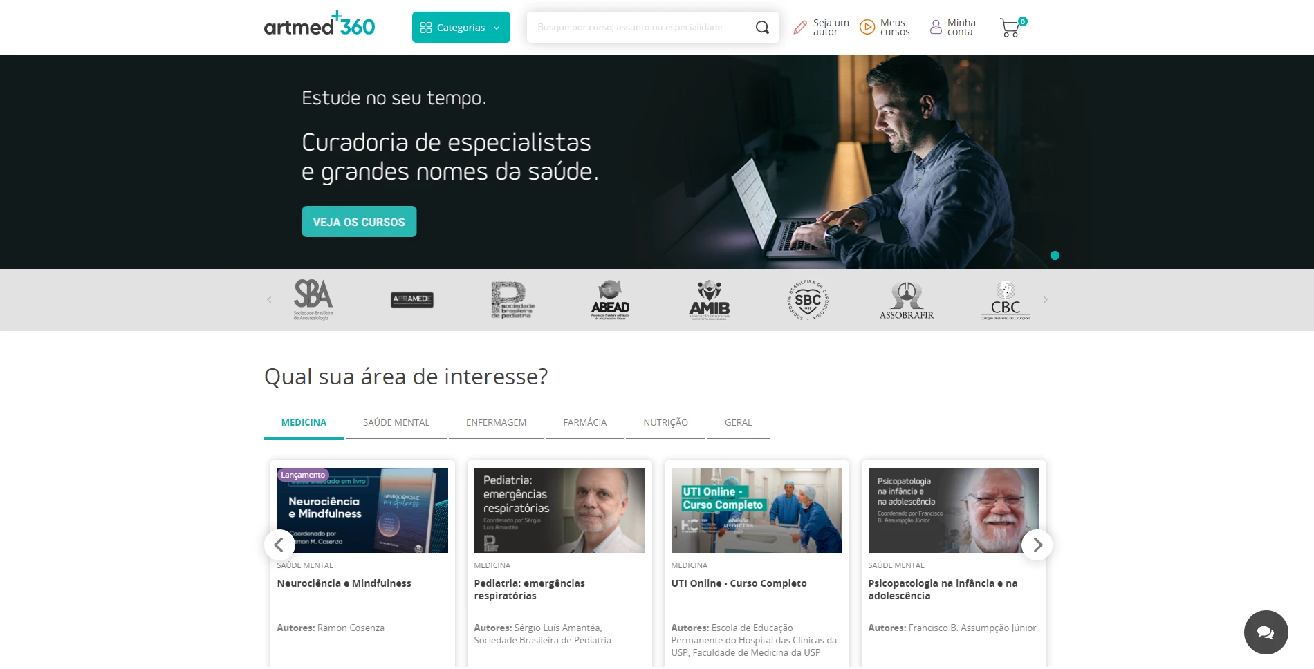
Home page
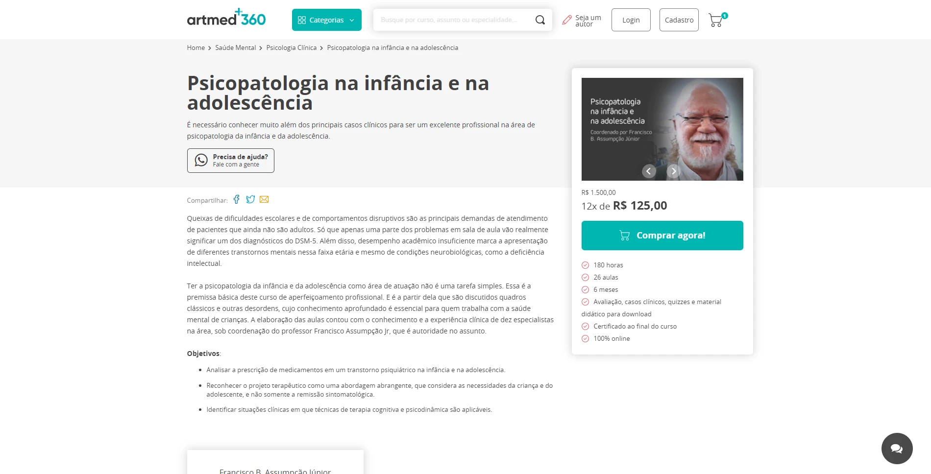
Course page
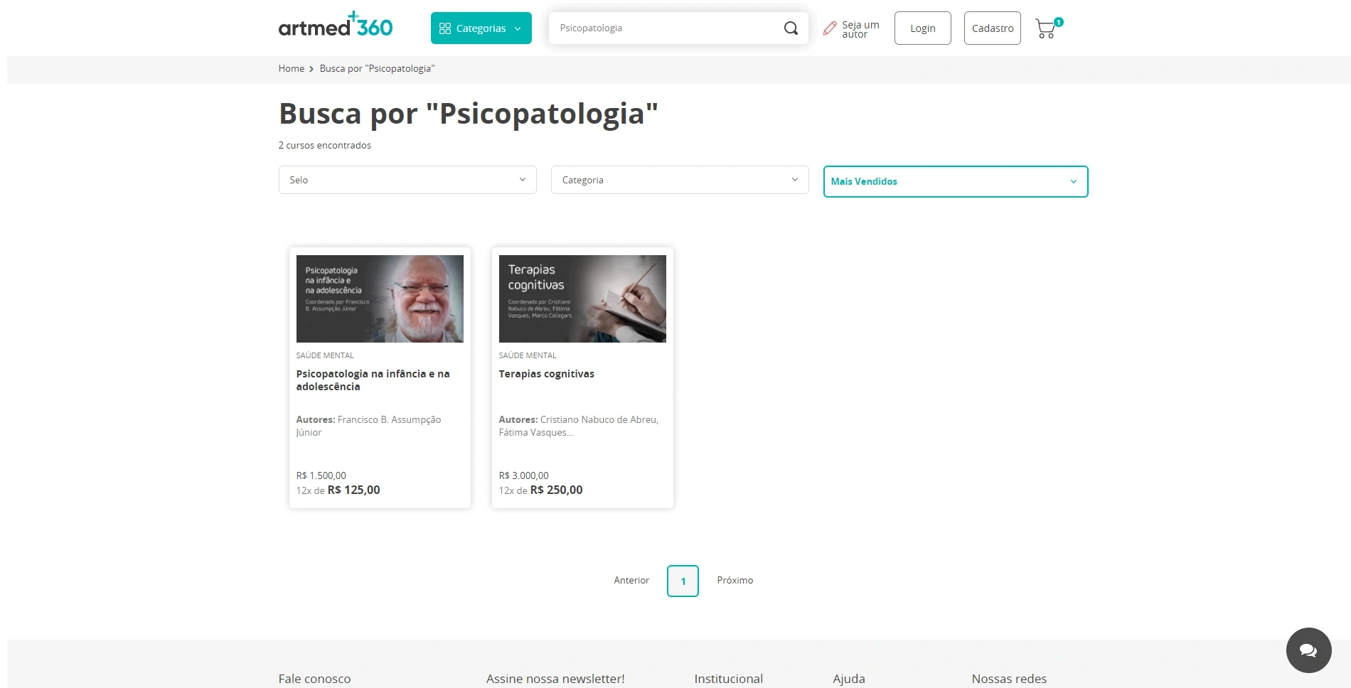
Search page
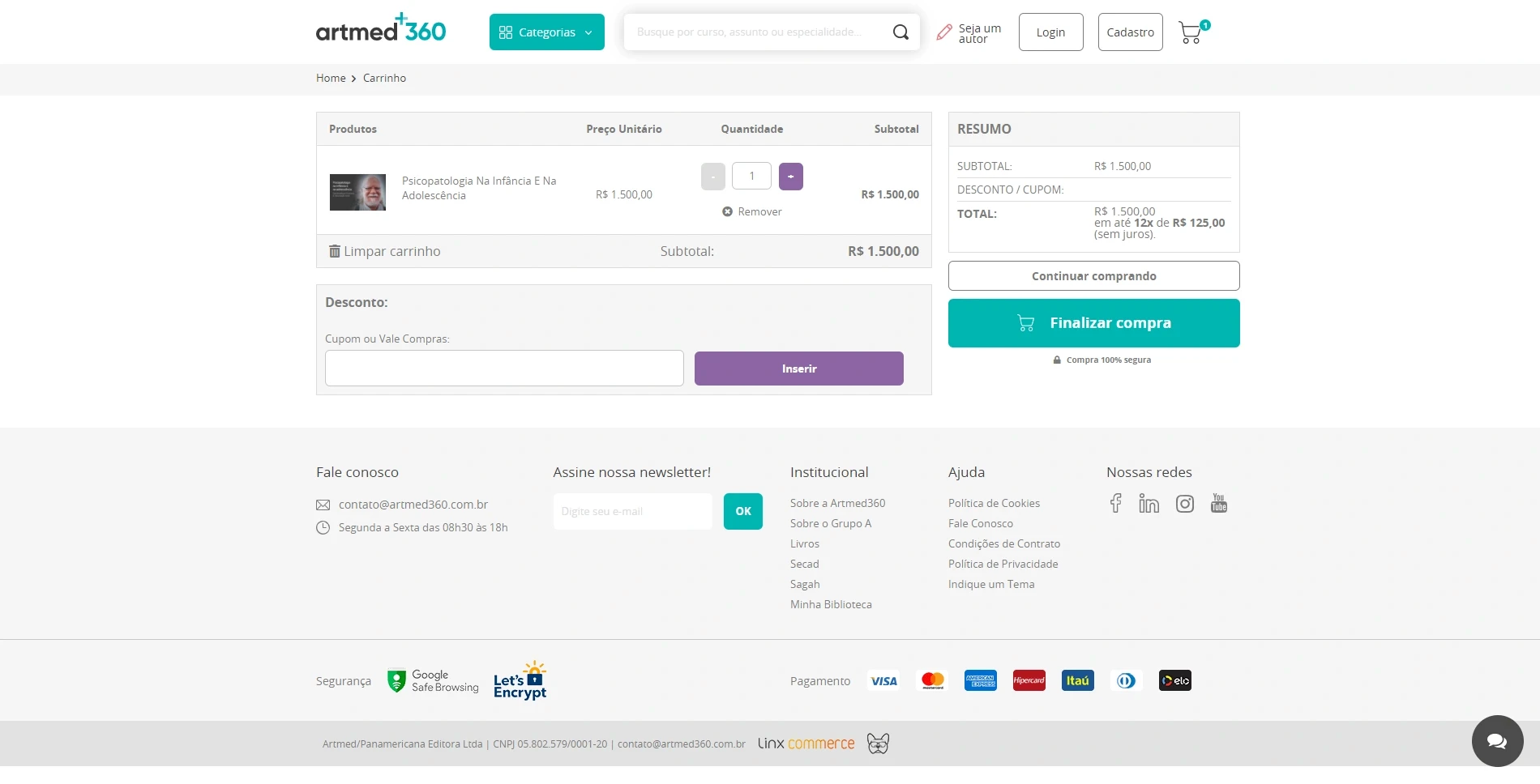
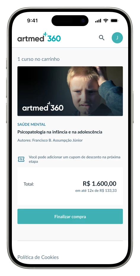
Cart page
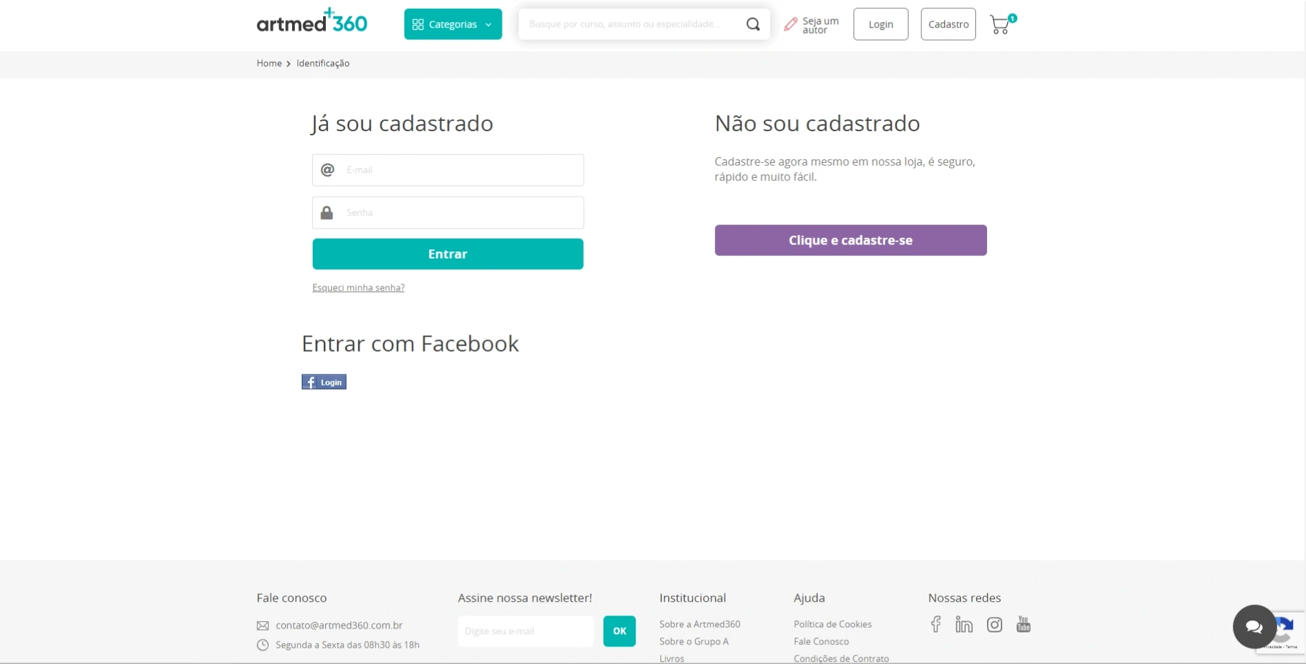
Login page
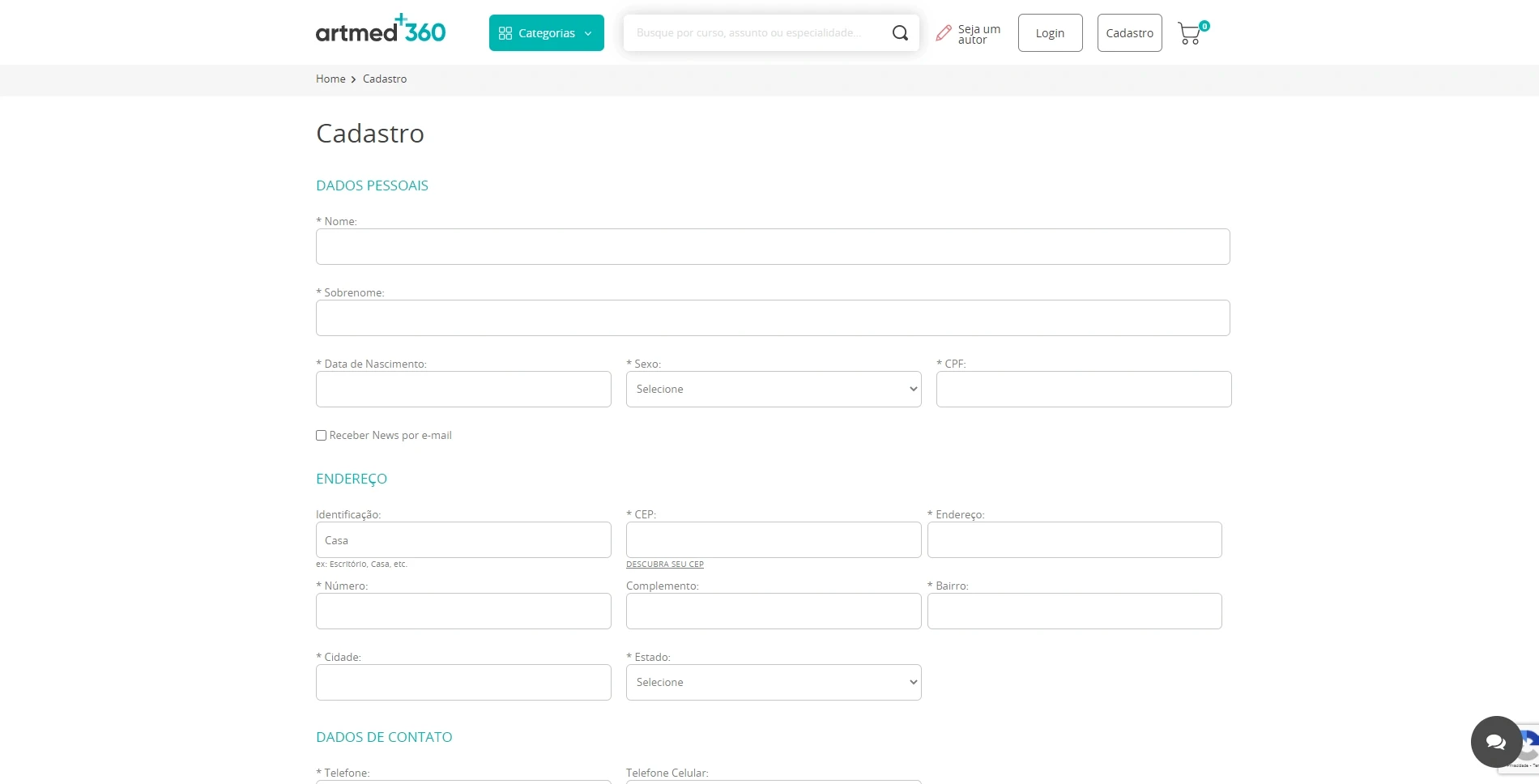
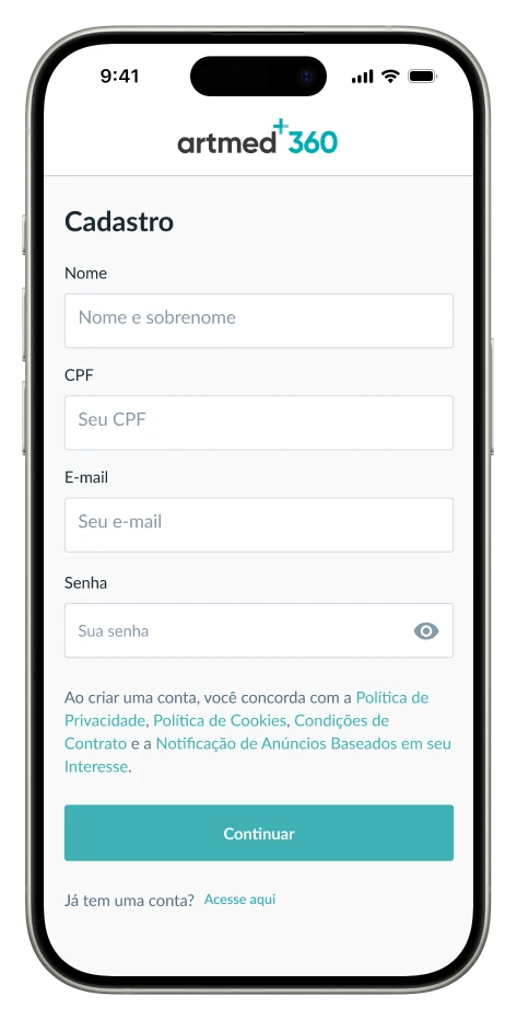
Sign up page
Previous User flow
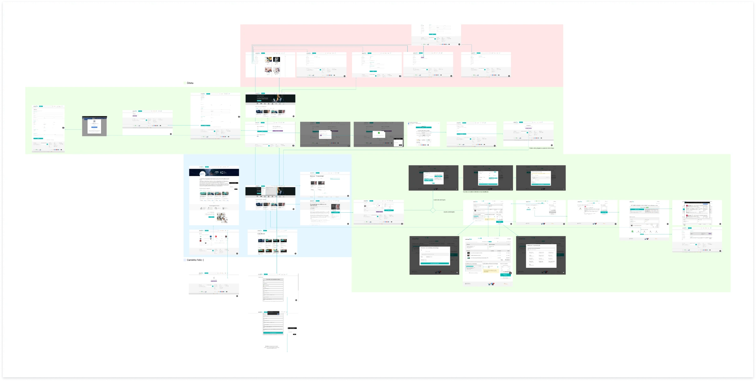
Red areas represent the logged-in section; green and blue are parts of our system to be integrated.
Designing the experience
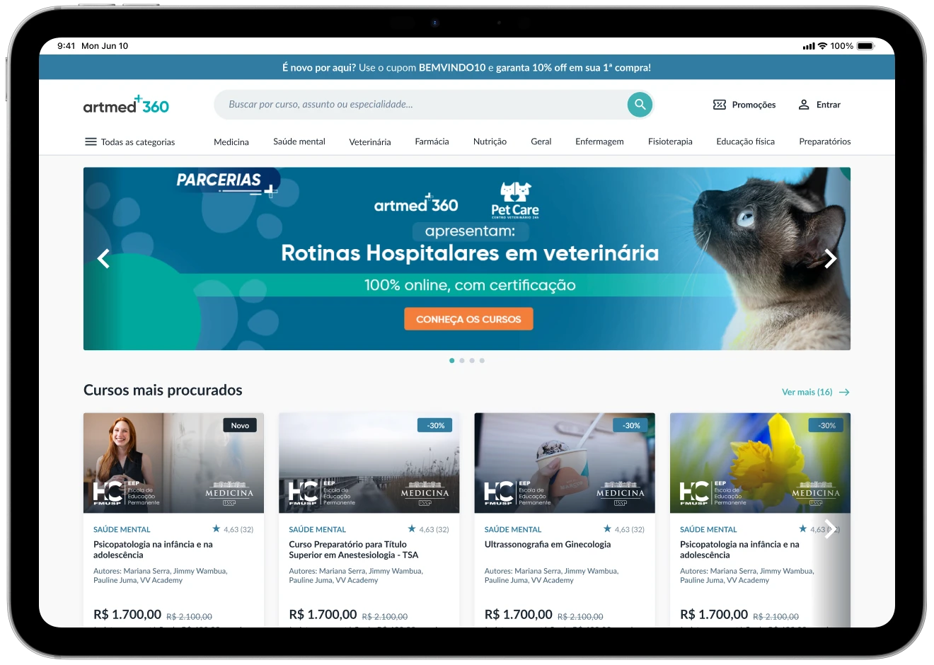
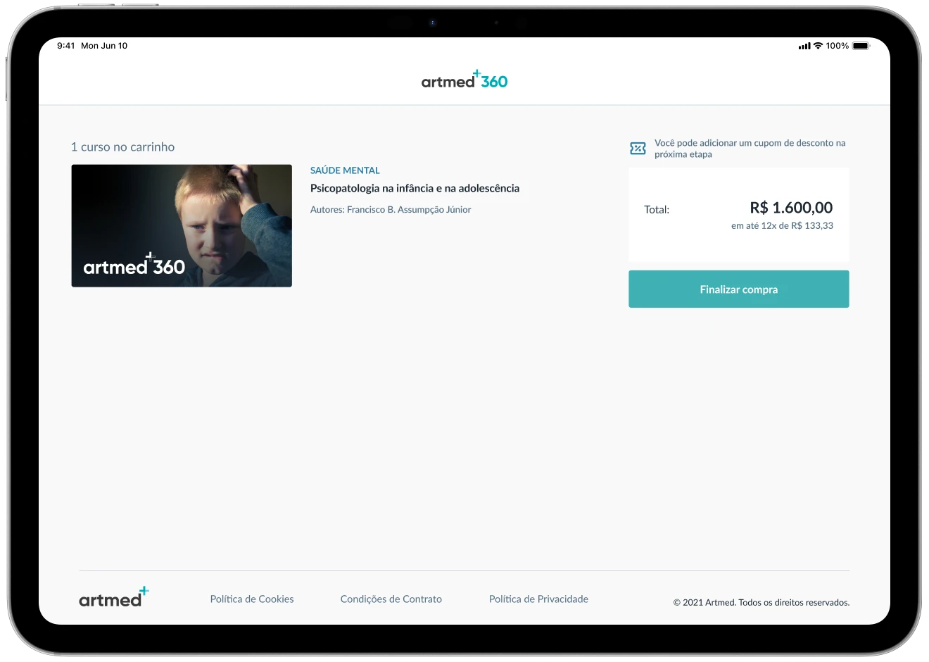
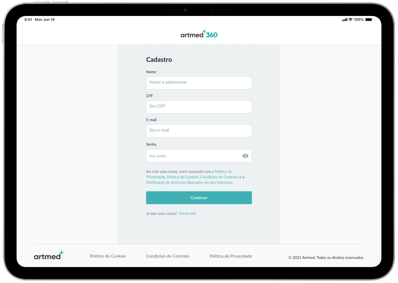
After aligning with stakeholders, I designed the following interface for the purchase flow, as well as the entire back-office configuration.
Benchmarking
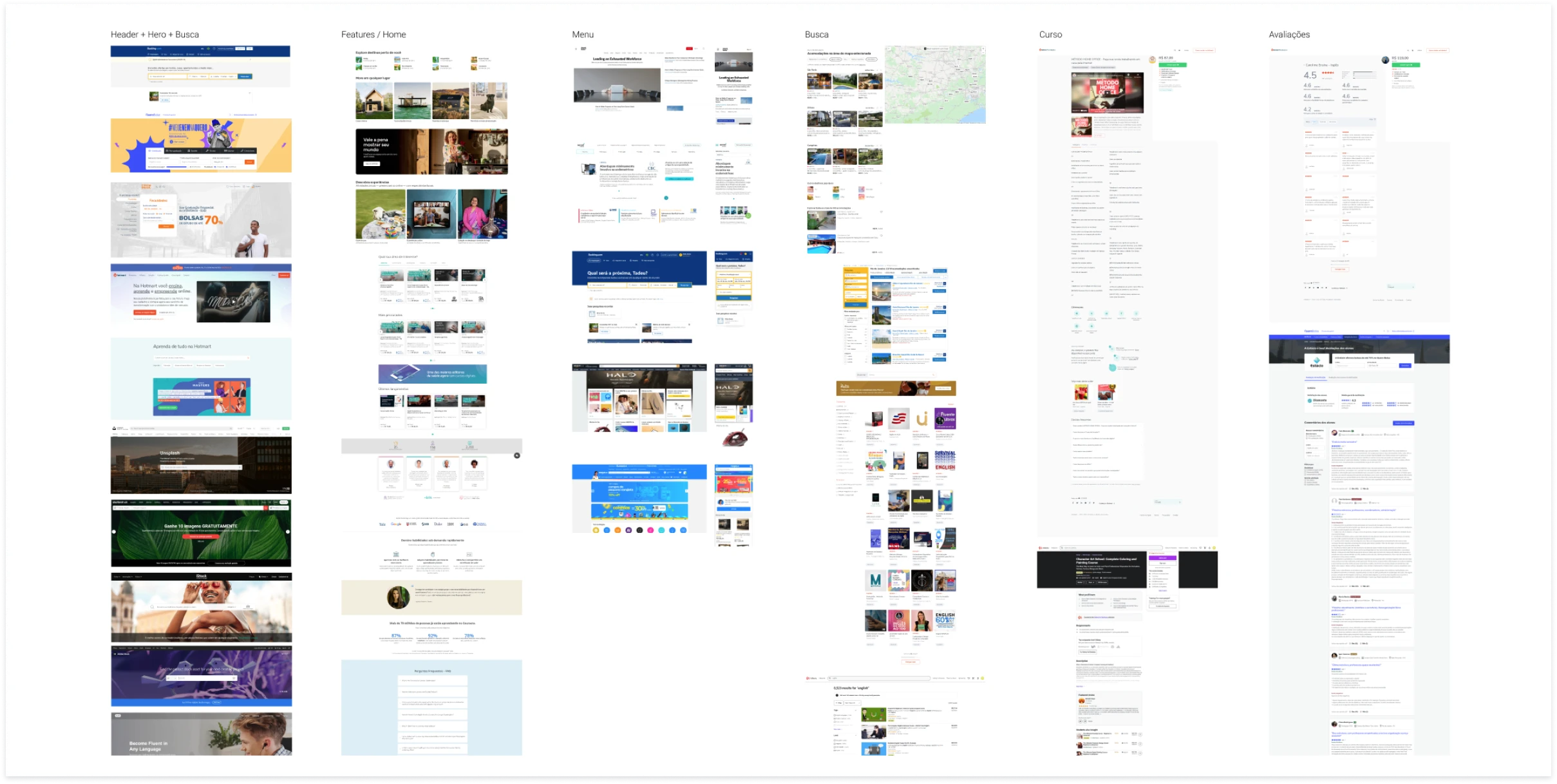
The main areas of the benchmark were: Hero + Search, Home, Menu, Search results, and Reviews.
Moodboard
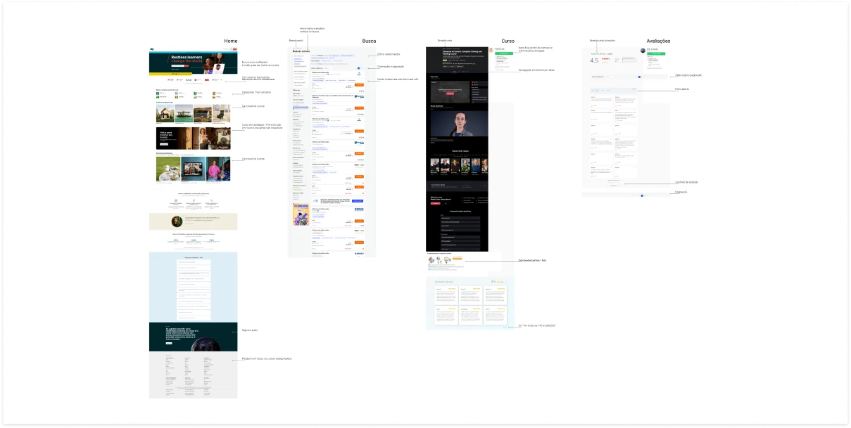
The main areas of the moodboard were: Home, Search results, Course, and Reviews.
Wireframes
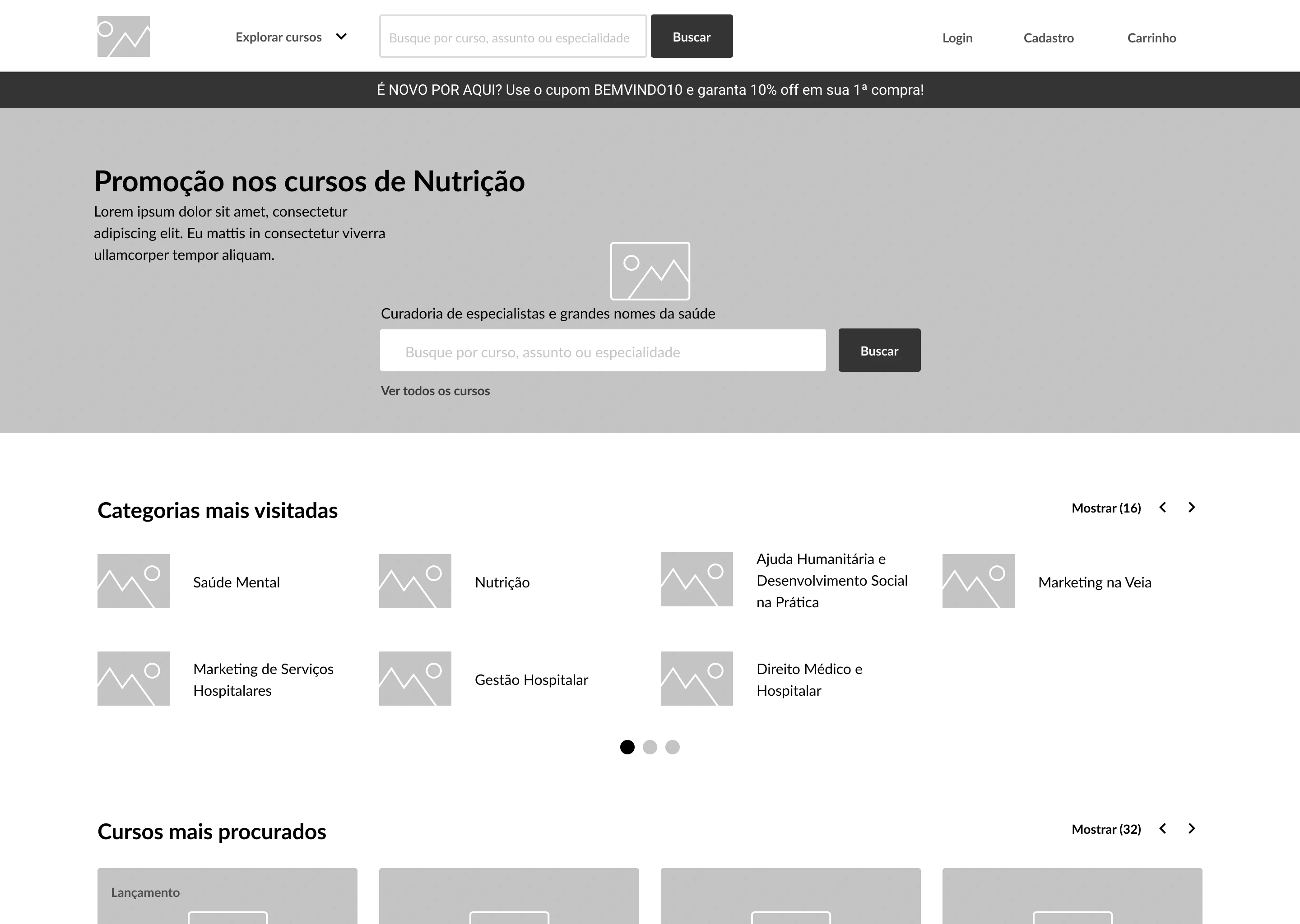
Home page
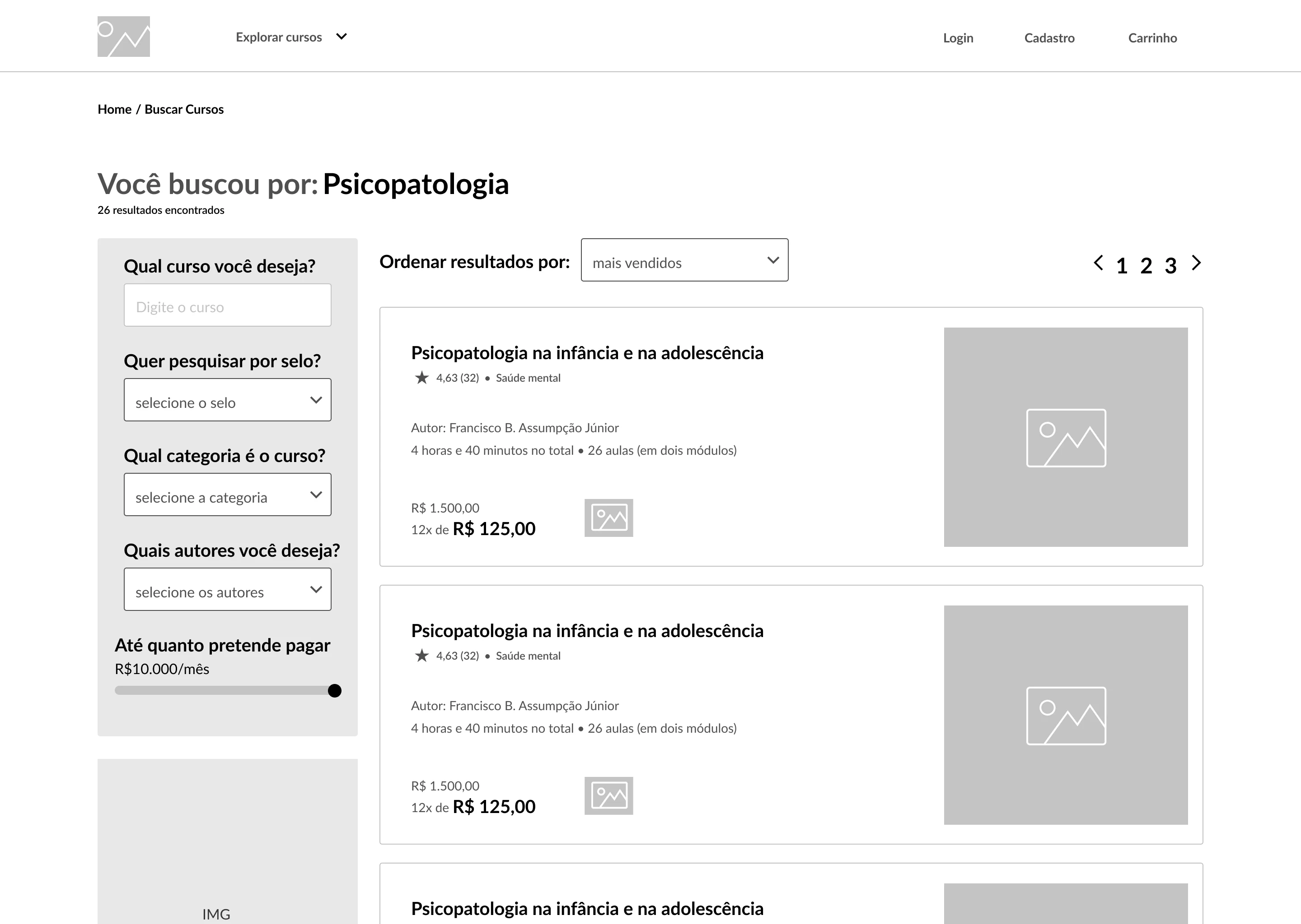
Search results page
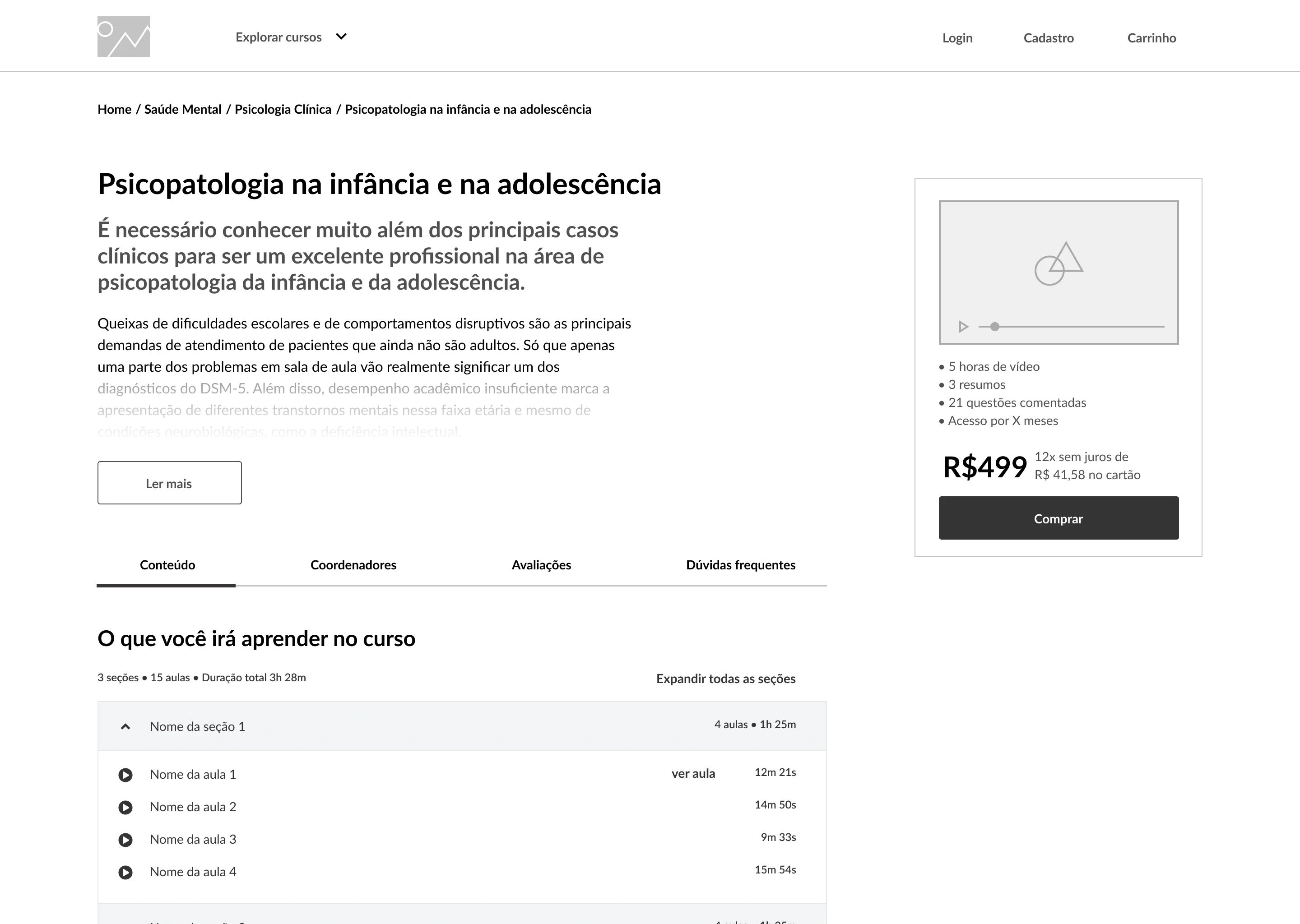
Course page
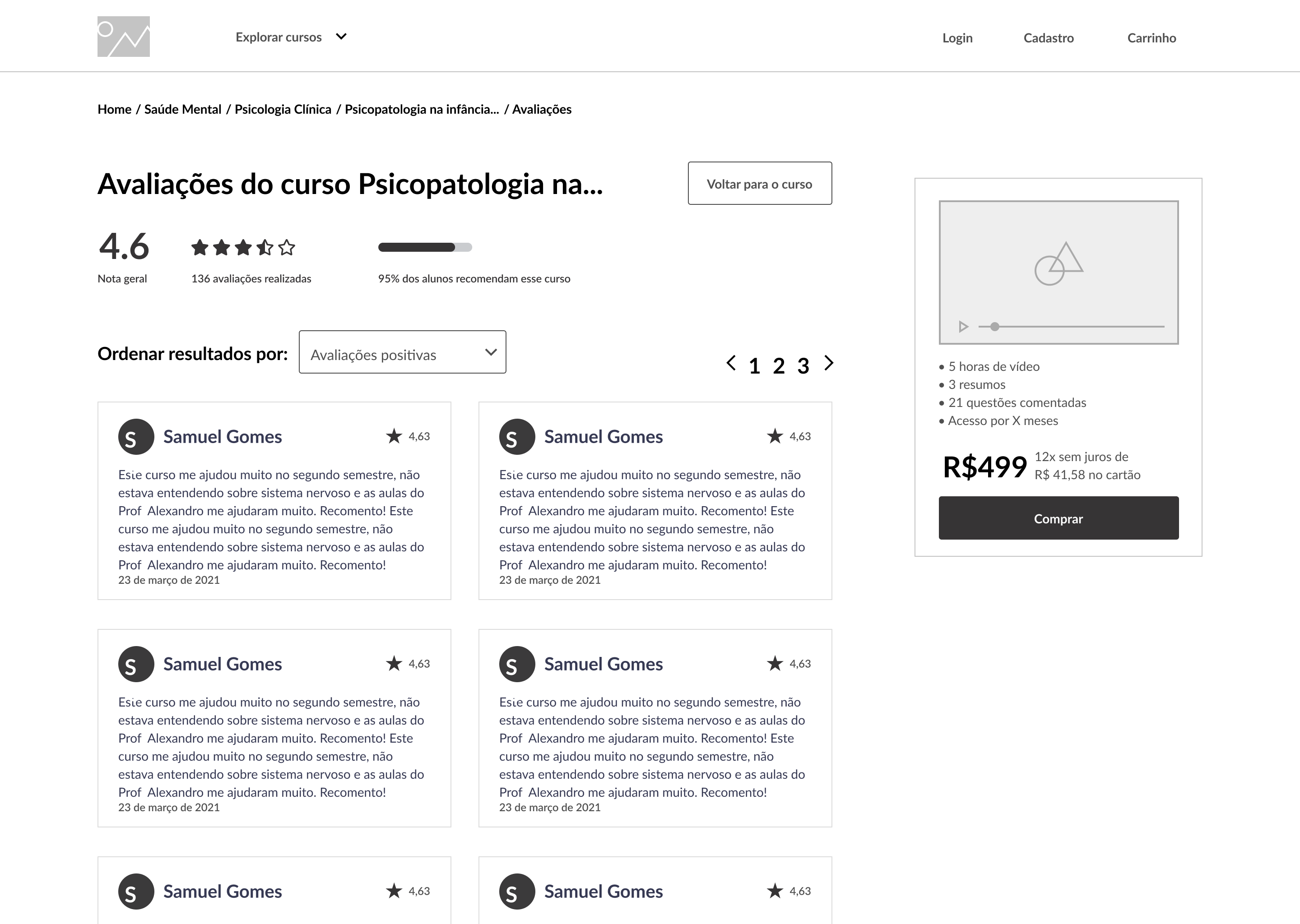
Reviews page



Results
To validate the prototype, usability tests were conducted, and users received a SUS survey afterward, which resulted in a score of 90.
The biggest challenge during this process was recruiting users for the tests.
The main point observed after the tests was the difficulty in finding where to click to access the purchased course. For example: some users expected the purchased course to appear immediately upon logging in. After these tests, the course access screen was set to redirect users immediately after purchase.
Post-launch improvements were implemented, such as allowing purchases without registration, enabling the product to quickly reach its time-to-value.
Thank you for your time
View other cases