Prototyping
•
Style Guide
•
Usability Testing
How I redesigned the postgraduate course purchase flow with a premium UI, achieving 57.14% faster navigation.
Squad team
Product manager, devs, and I
Role
UI/UX, Researcher, Recruiter
Tools
Figma, Miro, Maze
What were the problems?
The issue arose from a lack of a defined visual identity, leading to poor product-market fit and positioning.
Visual identity
Not mobile-friendly
Product-market fit
previous experience
The main screens and the user flow of the experience.



Desk research
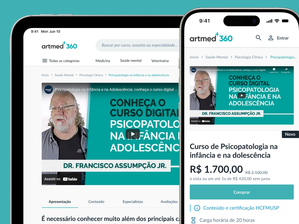
Benchmarking: it became clear that the user effort required to enroll using the website was much higher compared to competitors.
Market perception analysis: compared to other institutions offering the same model of digital post-graduate programs, the university was positioned with the second-highest price.
Redesigning the experience
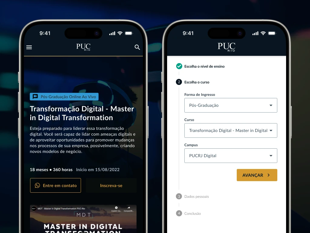
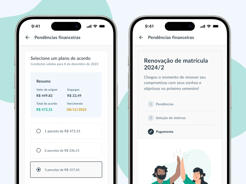
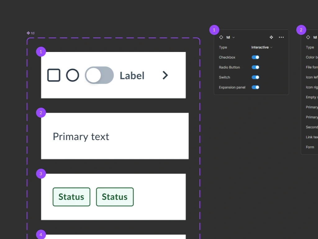
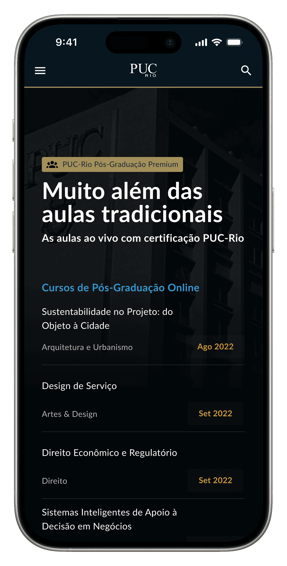
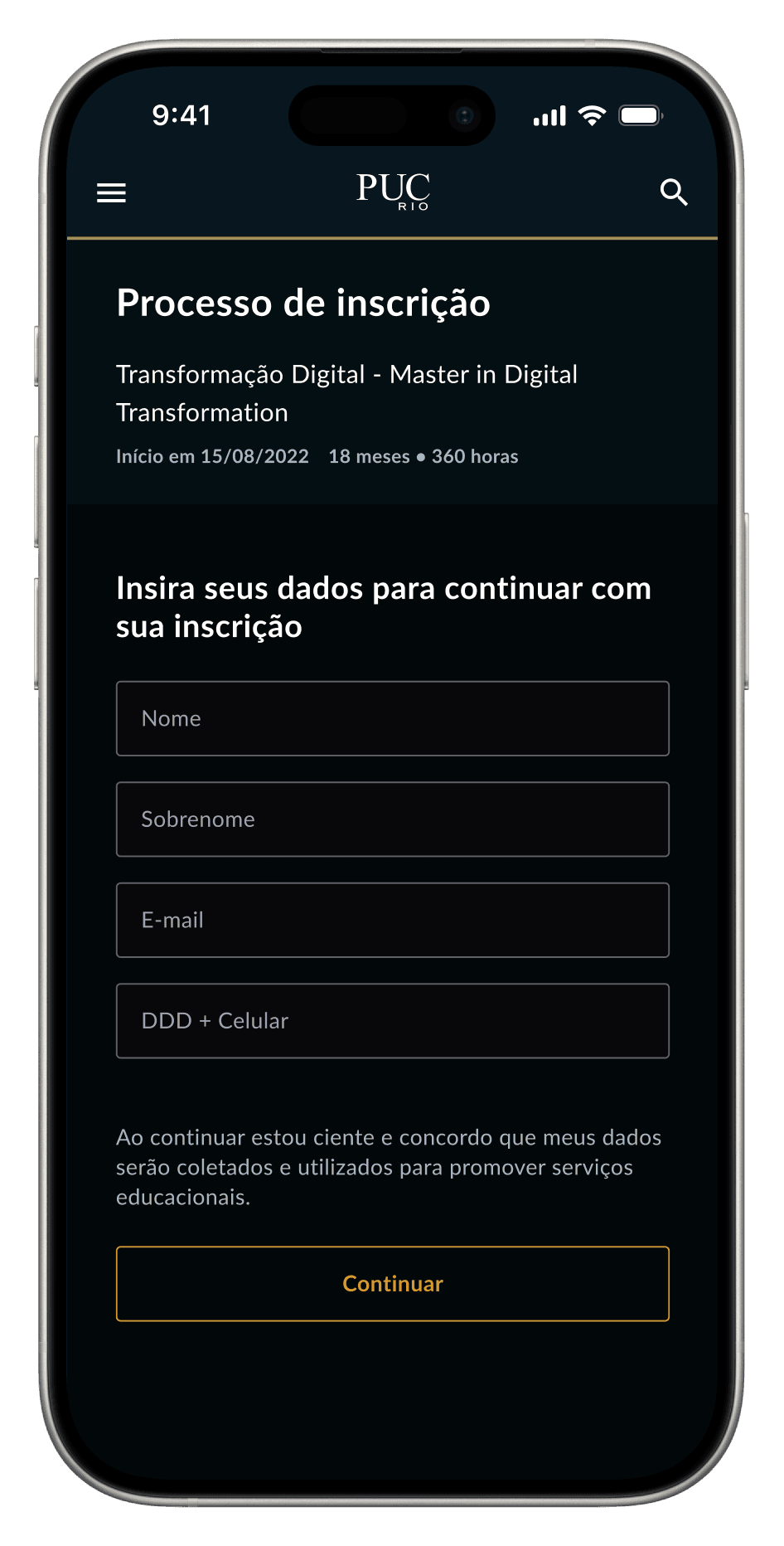
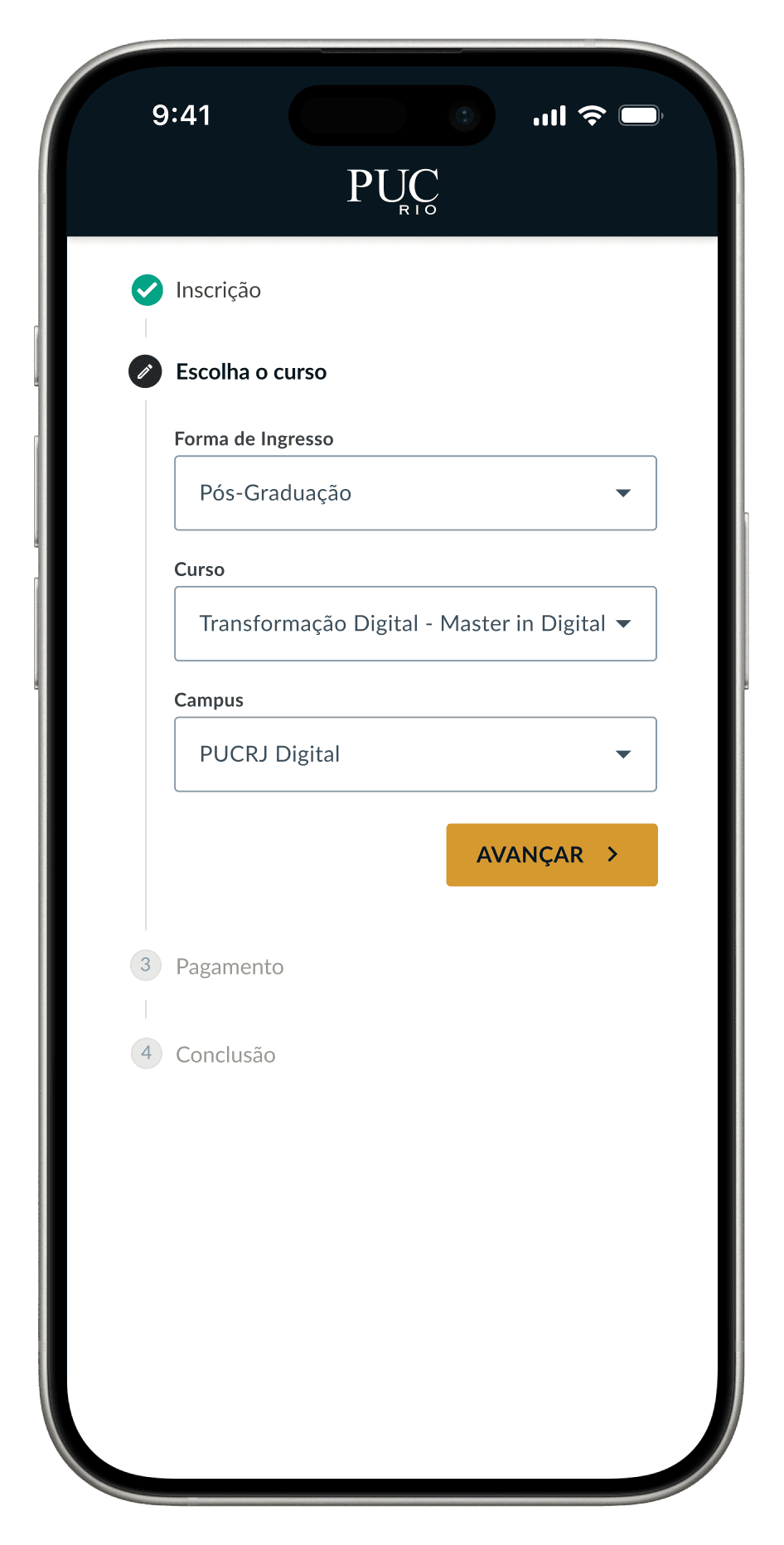
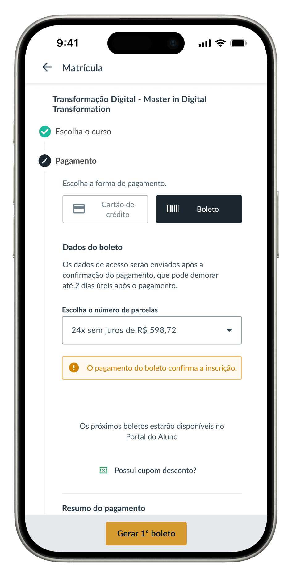
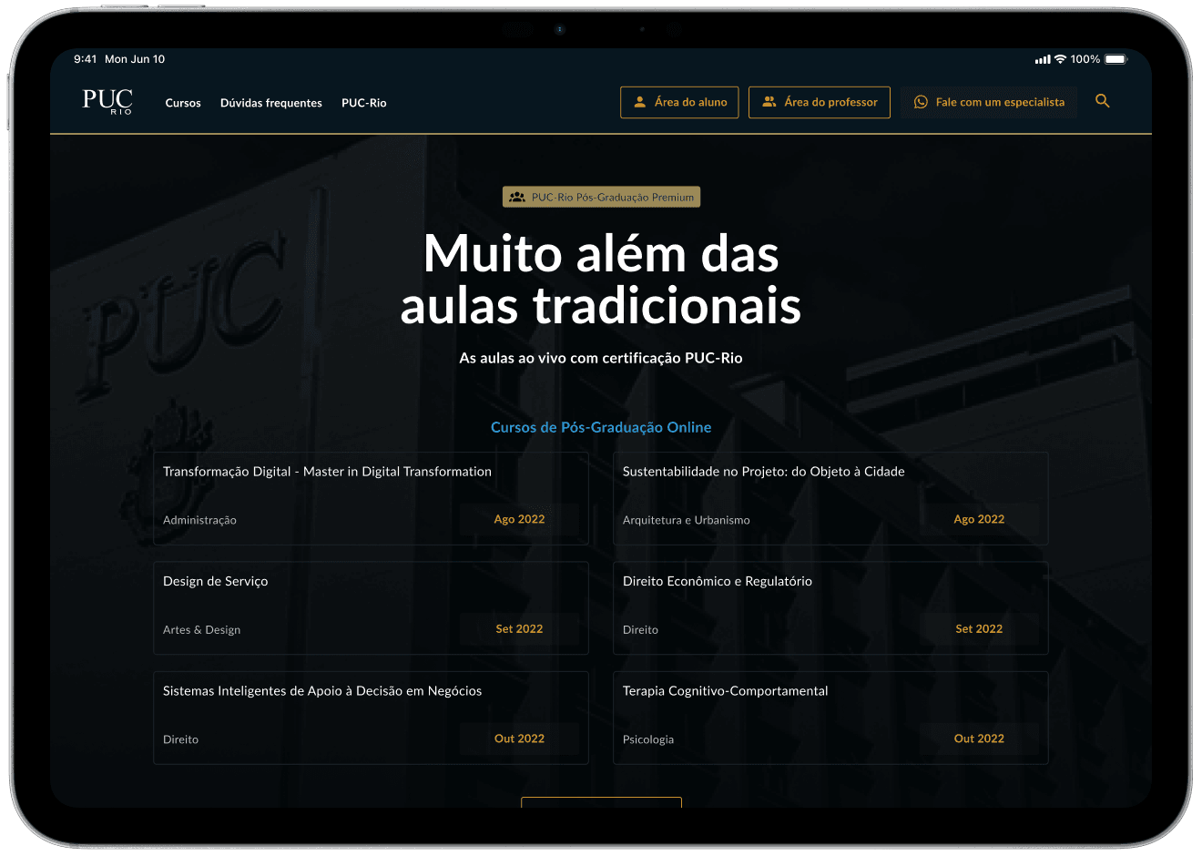
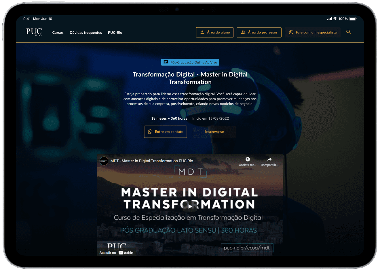
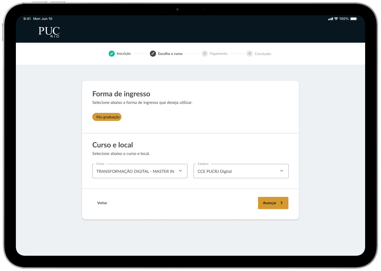
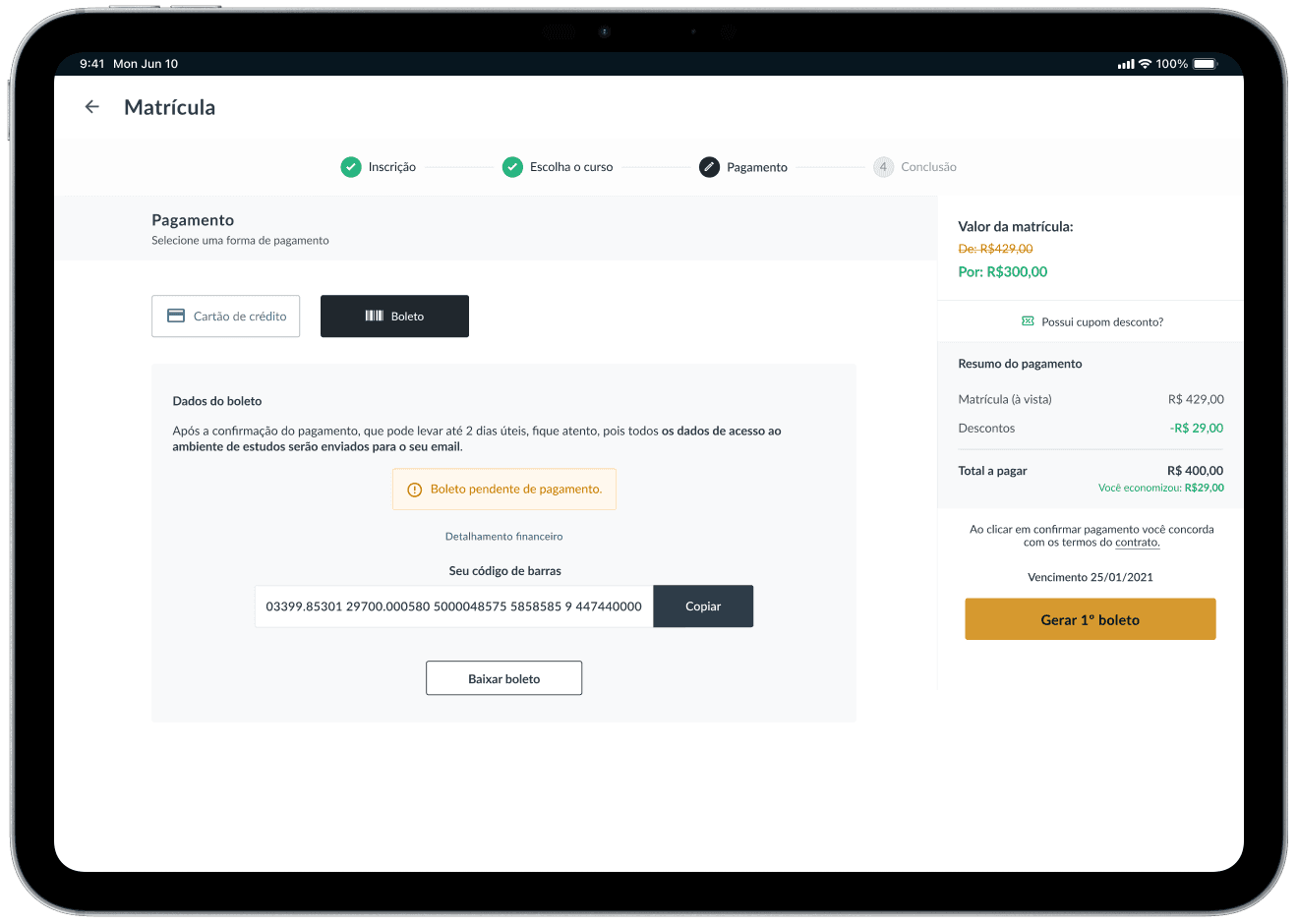
The redesign incorporated all aspects of the previous analysis. I created a style guide containing navigation components and a new color palette. Below, the simplified new course selection journey.


Results
Using Maze, two unmoderated usability tests were conducted to test the fluidity of navigation and the difference from the previous version: one test with the previous version and one test with the new version.
Regarding the recruitment of participants, it was done by me, and a discount coupon for the bookstore was used as an incentive to participate.
The 10 tests performed (5 of each model) resulted in 57.14% faster navigation and a 67% drop in the rate of incorrect clicks.
10 tests performed
57.14% faster
67% less missclicks
Thank you for your time
View other cases